6 Ways to Use the 2021 Pantone Colors of the Year
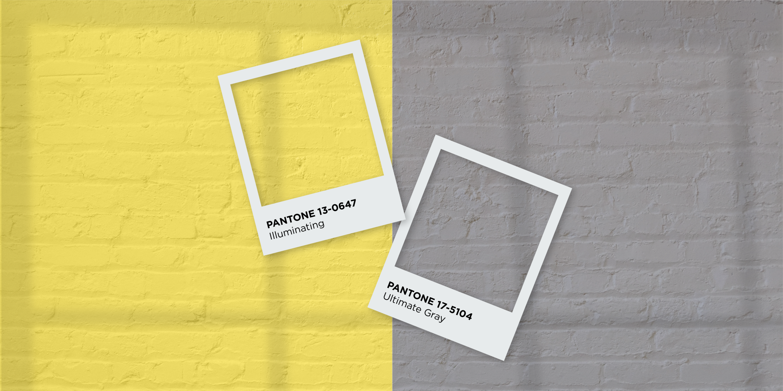
PANTONE® 2021 Colors of the Year
It’s no secret by now that Pantone named not one, but two hues for its 2021 Color of the Year — the sunny yellow PANTONE 13-0647 Illuminating, and the solid and grounded PANTONE 17-5104 Ultimate Gray. The two colors work together to help set the tone for a hopeful, yet dependable new year.
“The union of an enduring Ultimate Gray with the vibrant yellow Illuminating expresses a message of positivity supported by fortitude. Practical and rock solid but at the same time warming and optimistic, this is a color combination that gives us resilience and hope. We need to feel encouraged and uplifted; this is essential to the human spirit.”
— Leatrice Eiseman, Executive Director of the Pantone Color Institute
Sounds lovely, right? But what does that mean for your brand? How can you use those colors without looking like everyone else that’s using those colors?
While I don’t advocate for updating your brand’s color palette on an annual basis (remember, consistency is key), it’s very possible that this is your year for a refresh. If so, one way to make sure you’re using them in a unique way is to pair them with an expanded color palette. Here are 6 ideas plus a free, downloadable guide of ALL your color breakdowns!
The Earthy Palette
Adding these nature-inspired colors to Ultimate Gray and Illuminating creates a grounded yet rich palette—think new twist on an agricultural brand. It features a strong variety without being overwhelming.
2. The Youthful Palette
This bright and fun palette sets the tone for fun! It’s energetic and eye-catching, and while geared toward a younger audience, it may also draw in those older millennials and Gen-Xers looking for a new take on their neon days of the past.
3. The Modern Corporate Palette
The Modern Corporate Palette. Download a free guide of the color breakdowns for all 6 palettes here.
You don’t have to be tied to the boardroom blues and browns of the past just because you want a brand with a polished feel. Adding Ultimate Gray and Illuminating to this sleek and crisp palette can give a corporate brand some much-needed punch without losing its professional edge.
4. The Pop Culture Palette
Perfect for the arts, cuisine or cultural event, this palette emits excitement and flavor. Consider using these four vibrant colors along with Illuminating in a literature system or as a way to categorize events, with Ultimate Gray as a consistent, grounding color.
5. The Fashion-Forward Palette
We’ve seen the monochromatic hues that have been dominating the 2021 fashion scene so far. Not only can these bold colors can have quite a striking impact in the fashion world, they can make the visual elements of your brand feel modern and exciting as well. Use them in large swatches of flat color for an optimistic approach that’s sure to draw the eye.
6. The Health-Centered Palette
Fresh green colors always emit a sense of growth with their tie to nature. Makers of organic products and health foods have flocked to these colors for years. Consider modernizing those greens and occasional browns by introducing the optimistic yellow of Illuminating with Ultimate Gray as an additional neutral color.
Ready to update your palette but don’t feel these Pantone Colors of the Year are the right fit for you?
Let me help you expand your brand to give off just the right vibe for your target audience. Contact me today to start the conversation!


