6 Graphic Design Basics for Non-Designers

In a perfect world, every bit of communication that leaves a company would first pass through the hands of a skilled graphic designer. They could ensure every item is clean and professional, that your eye is drawn to the most important pieces of information and that you’re staying on-brand.
Wellll, we all know that isn’t reality. Many projects are so small they don’t warrant a graphic designer’s approval, or they need to move so quickly there just isn’t time. But, since everything your company puts out in the world inevitably becomes a reflection of it, it doesn’t hurt for non-designers to know a few graphic design basics. If you’re one of those non-designers, here are six tips to help you put together something polished even without the professional training.
1. Get moody

Looking for a little inspiration for your brand? Don’t be afraid to pull together samples of things you like into a mood board. Once you start combing through these pieces, you should notice some themes.
Maybe you like a specific style of imagery that is used throughout, or perhaps there are certain colors calling to you. Maybe you like more modern-looking designs, strategic use of infographics, or high contrast. Whatever it is, keep that inspiration in sight to help keep you in the right frame of mind as you design.
2. Color me excited
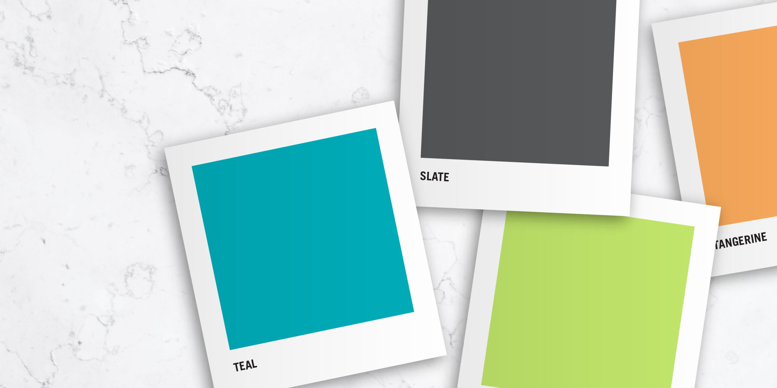
If your company doesn’t have a formal color palette, stop everything and create one now! Color is one of the key elements that will help you create a consistent visual branding experience.
Generally, the primary colors of your palette are the colors within your logo. Your secondary palette will consist of complementing colors that can be used to enhance the brand. If you’re really feeling inspired, you can add a tertiary color palette for even more depth, however you’ll want to set some specific rules for how and when you will use those colors. To keep things neat and clear, it’s best for beginners to just stick to a few colors overall and use them with consistency.
3. What the font?

The same general idea applies to your company fonts. If you don’t have a style guide establishing your fonts, it’s time to make some decisions. (If you do, by all means follow it!) A good rule of thumb is to stick to two font families that complement each other well - think a sans-serif and a serif option, typically. Don’t be afraid, you can still have lots of flexibility if you choose fonts with large families...regular, italic, semibold, semibold italic, bold, bold italic, and so on. If you don’t believe me, check out the photo above for how much variety you can get with just two font families.
Speaking of fonts…choose wisely. Different typefaces evoke different feelings and moods. Don’t use Comic Sans to promote your financial institution, or a traditional script font for your gym. Make sure your font choice doesn’t clash with the level of service or type of experience you provide.
Still stuck? Check out my list of 10 Free Designer-Approved Google Font Combos.
4. Time for an alignment

It’s often all the little things that can be the difference between something looking polished and professional, and something looking sloppy and amateurish. Making sure everything is aligned is one of those seemingly little things. Be conscious of where your text and images are placed. If you’re left-aligning content, be sure they all line up on the same line. If you want everything centered, then center it along the same axis. You may not notice when everything is aligned, but your brain will definitely tell you something is off if the alignment isn’t there.
5. The positives of negatives

As you design, don’t discount the importance of negative space. Also known as white space (but don’t let that term confuse you, more on that in a minute), negative space is the empty space within your design. It allows your eye to separate pieces of content, flow throughout the design, and aids in comprehension. When used appropriately, it can be a very useful tool that adds impact to a design.
How can you harness its power? Leave space between blocks of text and images. Make sure there is enough of a gap between columns of text to give your eye a break. Remember your margins! Text that goes to nearly the edge of a page makes readers feel claustrophobic. A little breathing room can make all the difference.
Remember that white space term I just threw at you? Here’s a little trade secret—white space isn’t always white. It could be of any color, pattern, or even part of an image, as long as it’s a break from the main content.
6. Embrace the hierarchy
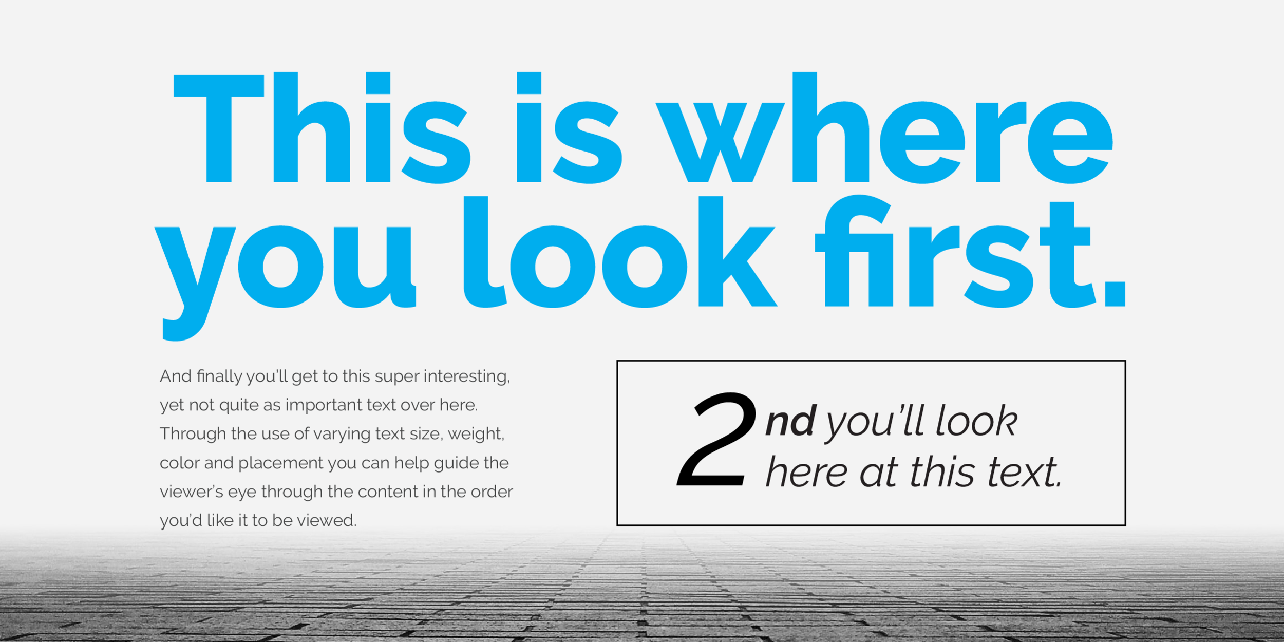
All content isn’t created equal. Think about the most important pieces of information you’re trying to convey, and make those stand out the most. A great place to start is the headline. Make sure it stands apart from the rest of the text. Perhaps a quote, statistic, or various subheads are the next most important items.
You can use tools like a change in font, scale (don’t be afraid to go BIG), extra white space, or a different color to draw the eye where you’d like it to go. Got a call to action? Don’t bury it within your text. Make it bold, add a box, give it some breathing room. Don’t be afraid to experiment!
All of this can be a lot to take in, so the most important piece of advice I can give is to keep it simple and consistent. With time and practice you’ll have a greater understanding of your brand and will gain the confidence to push the boundaries. For those larger projects that need a graphic designer’s eye, don’t be afraid to reach out to an experienced designer to make your project pop.