6 Ways to Use the 2025 Pantone Color of the Year
PANTONE 2025 Color of the Year — Mocha Mousse. Image courtesy of The Pantone Color Institute.
The 2025 Pantone Color of the Year — PANTONE 17-1230 Mocha Mousse — is a beautiful balance between comfort and sophistication. This warm hue evokes elegance and harmony, and if these are qualities you’re looking to convey with your brand, Mocha Mousse could be the perfect addition to your palette.
“For Pantone Color of the Year 2025, we look to a mellow brown hue whose inherent richness and sensorial and comforting warmth extends further into our desire for comfort, and the indulgence of simple pleasures that we can gift and share with others.”
— Laurie Pressman, VP Pantone Color Institute
If you’re looking for a refresh but not sure where to start, here are six color palette ideas featuring Mocha Mousse plus a free, downloadable guide of ALL the color breakdowns!
1. Elevated Comfort
The Elevated Comfort Color Palette. Download a free guide of the color breakdowns for all 6 palettes here.
The Elevated Comfort color palette combines Mocha Mousse with a selection of warm and welcoming hues. It conveys openness and familiarity with the perfect amount of restraint.
2. Frosty Meets Fierce
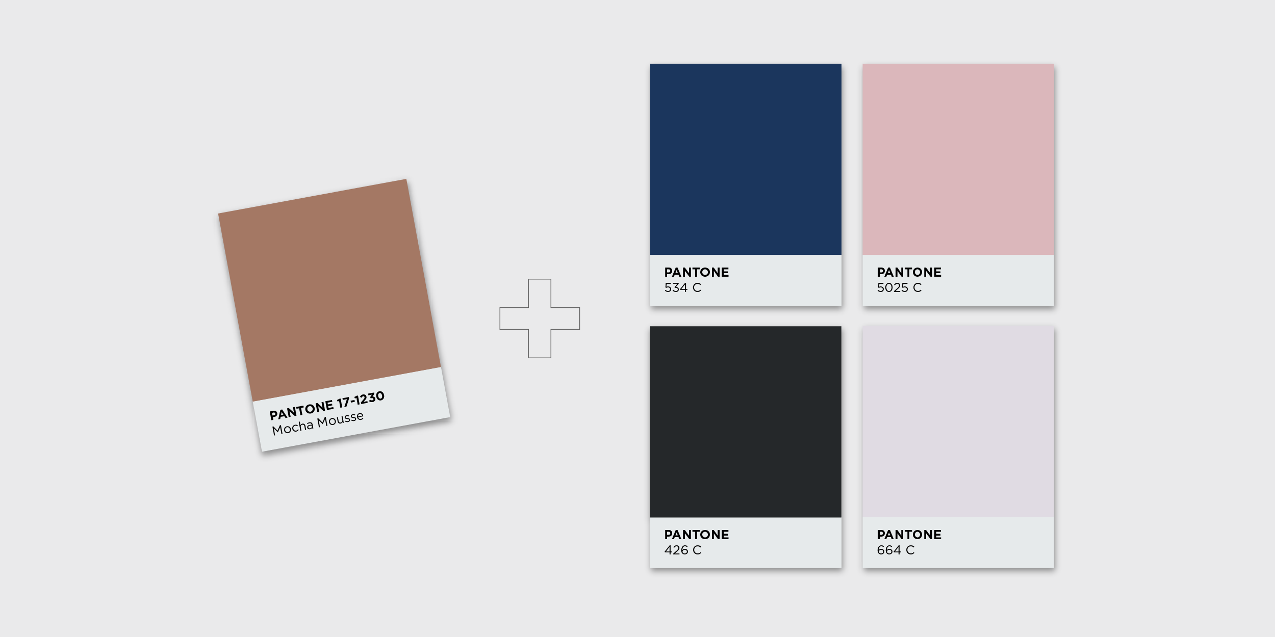
The Frosty Meets Fierce Color Palette. Download a free guide of the color breakdowns for all 6 palettes here.
Balance the warmth of Mocha Mousse with an icy coolness in this Frosty Meets Fierce color palette. A brand showcasing these hues is stylish and chic — and knows it.
3. Sweet Sophistication
The Sweet Sophistication Color Palette. Download a free guide of the color breakdowns for all 6 palettes here.
For delicate, sugary sweetness vibes, look no further than the Sweet Sophistication color palette. These gorgeous pops of color are grounded when paired with Mocha Mousse for a fun brand that doesn’t want to go over-the-top.
4. Low-Key Royalty
The Low-Key Royalty Color Palette. Download a free guide of the color breakdowns for all 6 palettes here.
Can approachable and luxurious be used to describe the same thing? If so, the Low-Key Royalty color palette just might be the one to pull off that description. It combines warm, indulgent hues with cooler, confident tones for an oh-so-elegant brand.
5. Quiet Luxury
The Quiet Luxury Color Palette. Download a free guide of the color breakdowns for all 6 palettes here.
The Quiet Luxury color palette is confidently dialed in and focused in a way that exudes richness and elegance. If you want your brand to showcase beauty without boasting, consider this sophisticated combination of colors.
6. Delicate Harmony
The Delicate Harmony Color Palette. Download a free guide of the color breakdowns for all 6 palettes here.
The Delicate Harmony color palette complements Mocha Mousse in a relaxed, comforting way. It’s understated and unpretentious — a great option for a brand wanting to convey warmth and stability.
Ready to update your palette but don’t feel the 2025 Pantone Color of the Year is the right fit for you?
Let me help you expand your brand to give off just the right vibe for your target audience. Contact me today to start the conversation!


